Each dashboard is made up of widgets. Each widget contains different sets of data. Bigtincan’s Analytics data model only extracts data from the core databases going back to January 1st, 2020. The reason for this is that we do not want to bloat our reporting databases with old data.
*Note: If a customer needs data from before January 1st, 2020. We can make exceptions and gather the data for them. However, for most customers, their data will only go back to January 1st, 2020.
Overall Engagement
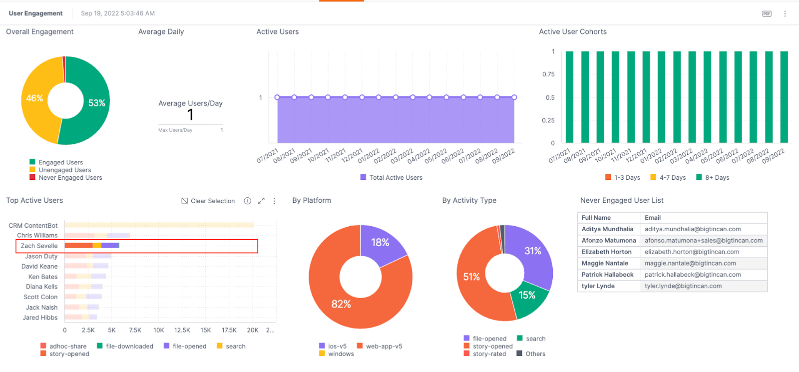
The ‘Overall Engagement’ widget shows administrators exactly how their user database is performing.
Bigtincan defines an engaged user as someone who has used the platform within the past 30 days from the current date. An unengaged user is someone who has accessed the platform in the past. However, they have not accessed the platform within the past 30 days from the current date. Never Engaged users are the users who have never accessed the platform.
Average Daily Widget
The ‘Average Daily Widget” focuses on how many users come to the platform on average per day.
The Max/Users correlates to the most users that accessed the platform on any given day.
Active Users
The ‘Active Users’ widget is a chronological data map that shows how many users visited the platform month after month. You will easily be able to view trends and you can also view the number of active users on any given month.
Selecting a month data point within the map will result in some of the widgets filtering the information to the given month selected. Selecting the ‘Clear selection’ icon will clear the month selected.
You can highlight a time period of multiple months on the map by dragging a data window over the months you would like to see. You can then click on the select button and the map will filter the data for the highlighted months.
You can right-mouse-click on any given month and then drill down to more granular data points, as well as filtering between days or weeks. Change the time period of the data by opening the filter menu and changing the filter to the month/year you would like.
Active User Cohorts
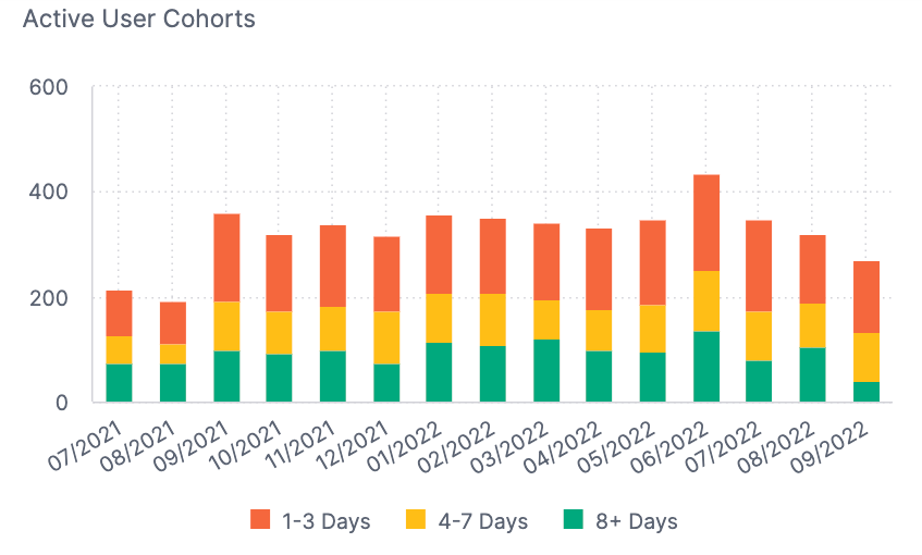
The ‘Active User Cohorts’ widget breaks down the monthly active user count into different cohorts of users and their activity levels.
You can see the percentage of active users and how often they visited month after month.
-
The red represents the user being active for 1-3 days.
-
The yellow represents the user being active for 4-7 days.
-
The green represents the user being active for 8+ days.
Top Active Users
The ‘Top Active Users’ widget showcases the top ten active users on the tenant based on their activity levels across a handful of data points.
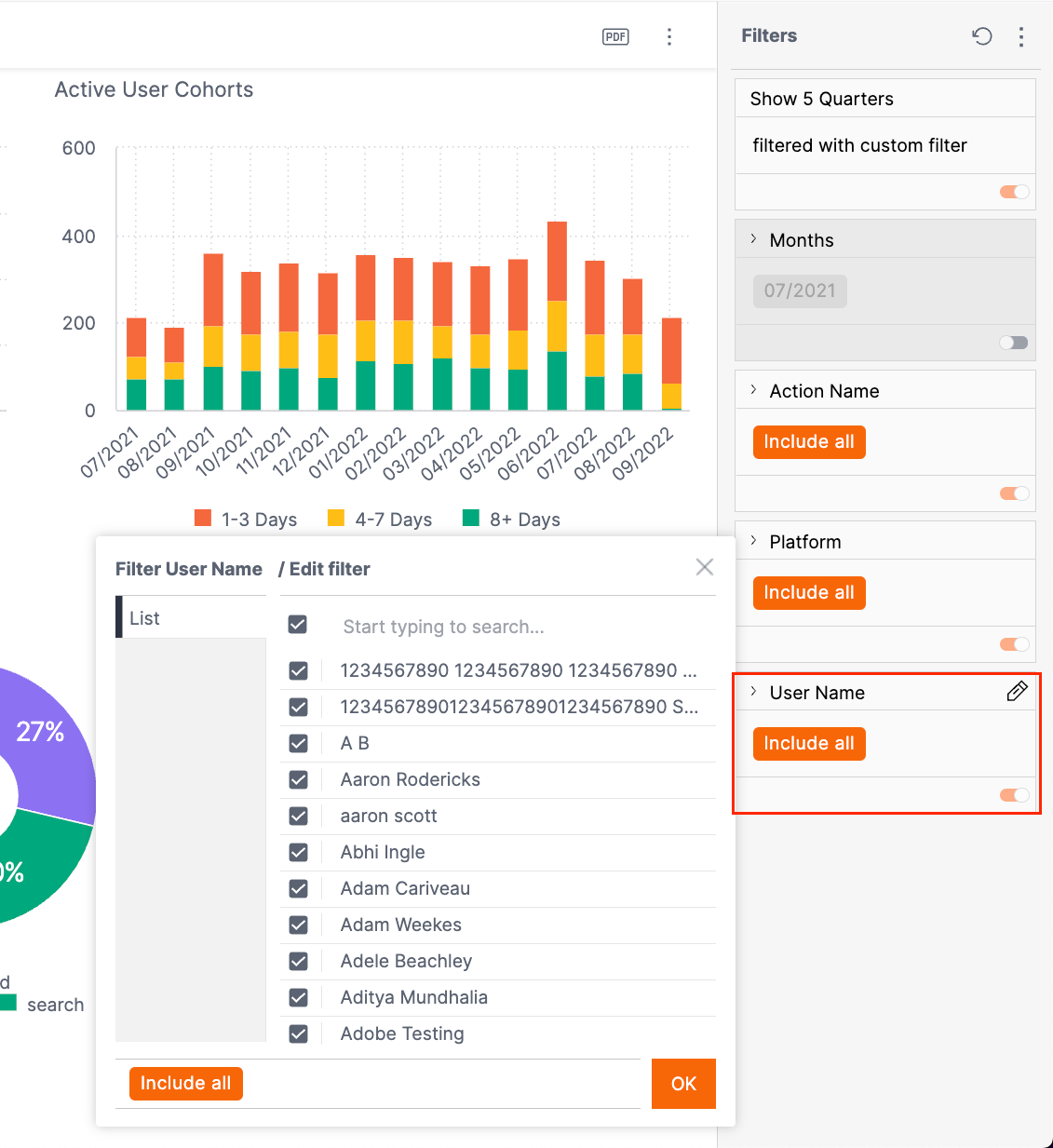
If you have a user that may skew the data points, you can filter out certain users by their email under the filter menu.
You can click on any name and it will filter the rest of the widgets to showcase information related to that user.
By Platform
The ‘By Platform’ widget breaks down the types of apps users are currently using on the tenant.
By Activity
The ‘By Activity’ widget breaks down the different activities that users are currently doing.
Clicking on a slice of the pie chart will break down the activity type even further.
Never Engaged User List
The ‘Never Engaged Users List’ is the list of users and their email addresses that have never engaged.
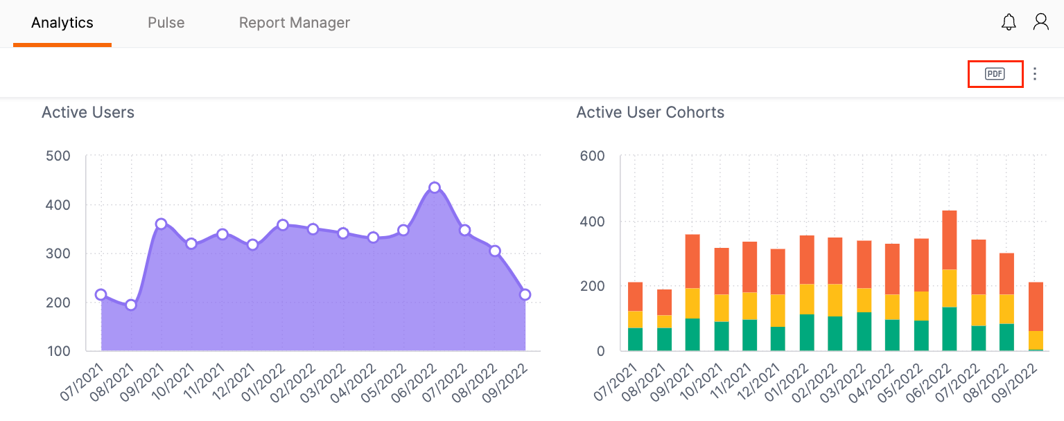
You can export any dashboard by clicking on the export button. From here, you will be able to export the dashboard as a PDF or even print out the dashboard.
Comments
0 comments