ClearSlide’s Dashboard Insights gives you a high-level overview of your team’s activities within a date range you can specify. Sales leaders can quickly see and understand which teammate is advancing in the leaderboard, who the top customers are, and which meeting had the highest engagement.
In this article, we will cover the following topics:
- Filter your Dashboard by Group(s)
- Set Activity Date Range
- Engagement Overview
- Engagement Leaderboard
- Top Customers
- Top Meetings
Navigate to the Dashboard page by clicking Insights on the left navigation menu.
Filter by Group(s)
By default, the Dashboard will display information for all groups in your organization. You could filter to see specific group(s) engagement data by following these steps:
1. Click the Filters button on the top right of the Dashboard page
2. Click Edit and select your desired group(s)
3. Click Done and “x” out of the Report Filters panel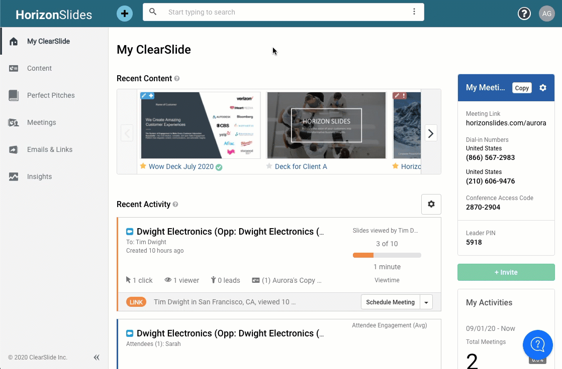
Set Activity Date Range
By default, the Activity Date range is set for the Last 7 Days of engagement activities. You can adjust the date range to suit your needs by clicking the Activity Date drop-down and selecting your desired range: Last 30 Days, Month to Date, Quarter to Date, etc. 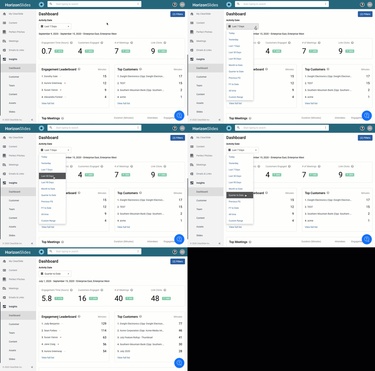
Engagement Overview
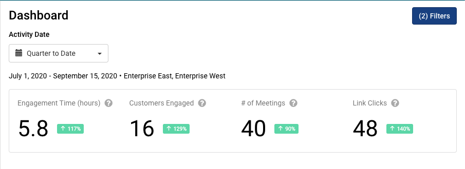
The engagement overview box contains four data points and their rate of increase/decrease within the set Activity Date range:
- Engagement Time indicates the total meeting, emails, and link engagement time in hours.
- Customers Engaged is the total number of customers/accounts engaged from meeting attendance or content link views.
- # of Meetings indicates the total number of customer/account meetings.
- Link Clicks is the total number of ClearSlide content views sent across any communication channels; Create Link content sent via your email, content sent via Compose Email, and content sent via Gmail/Outlook plugin.
Engagement Leaderboard
The engagement leaderboard shows the top 5 team members ranked by the amount of engagement time they generated via meetings, emails and links within the set Activity Date range.
- The upward pointing green triangle on the right of a team member’s name indicates their ascending rank from the previous period and hovering over the triangle will display their ranking from the last period.
- The downward pointing red triangle on the right of a team member’s name indicates their descending rank from the previous period and hovering over the triangle will display their ranking from the last period.
- The number on the right of a team member’s name is the total number of customer engagement minutes generated by meetings, emails, and links they hosted or sent.
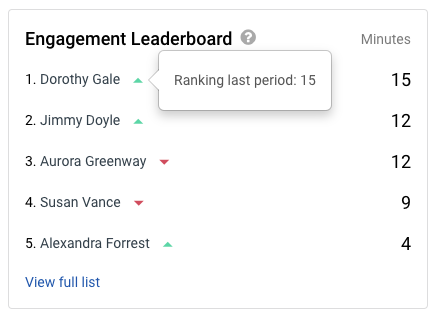
- To see the full list of team members and their rankings, click the View full list link.
Top Customers
The top customers box shows the top 5 customers/accounts ranked by the amount of time they engaged with your team across meetings, emails, and link views.
- The number on the right of the customer/account name is the total number of engagement minutes for the set Activity Date range.
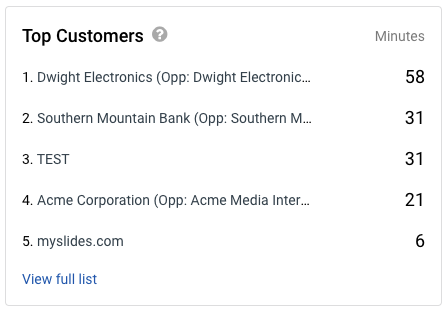
- To see the full list of customers/accounts and their rankings, click the View full list link.
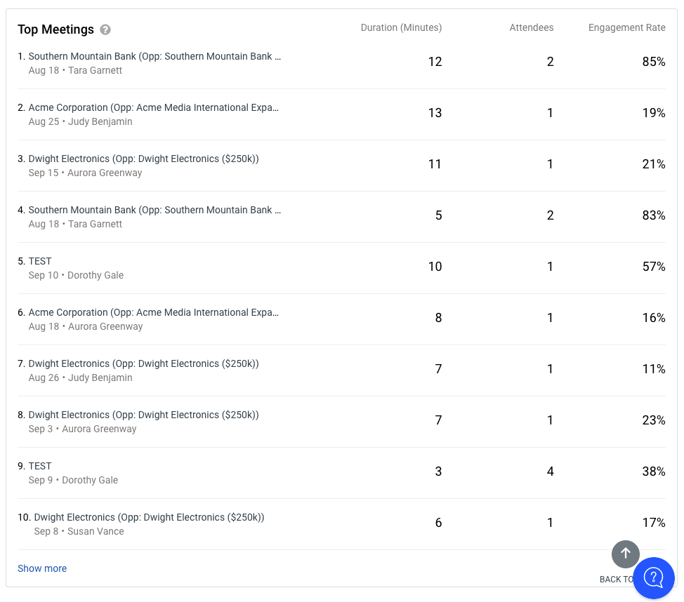
Top Meetings
The top meetings box shows the top 10 meetings ranked by total Facetime within the set Activity Date range.
- The first column displays the customer/account names, and the second column displays the duration of the associating meeting in minutes.
- The third column displays the number of attendees and the fourth column displays the engagement rate of that meeting. (For more information about meeting engagement rate, please review our article on Understanding Meeting Recap page.)
