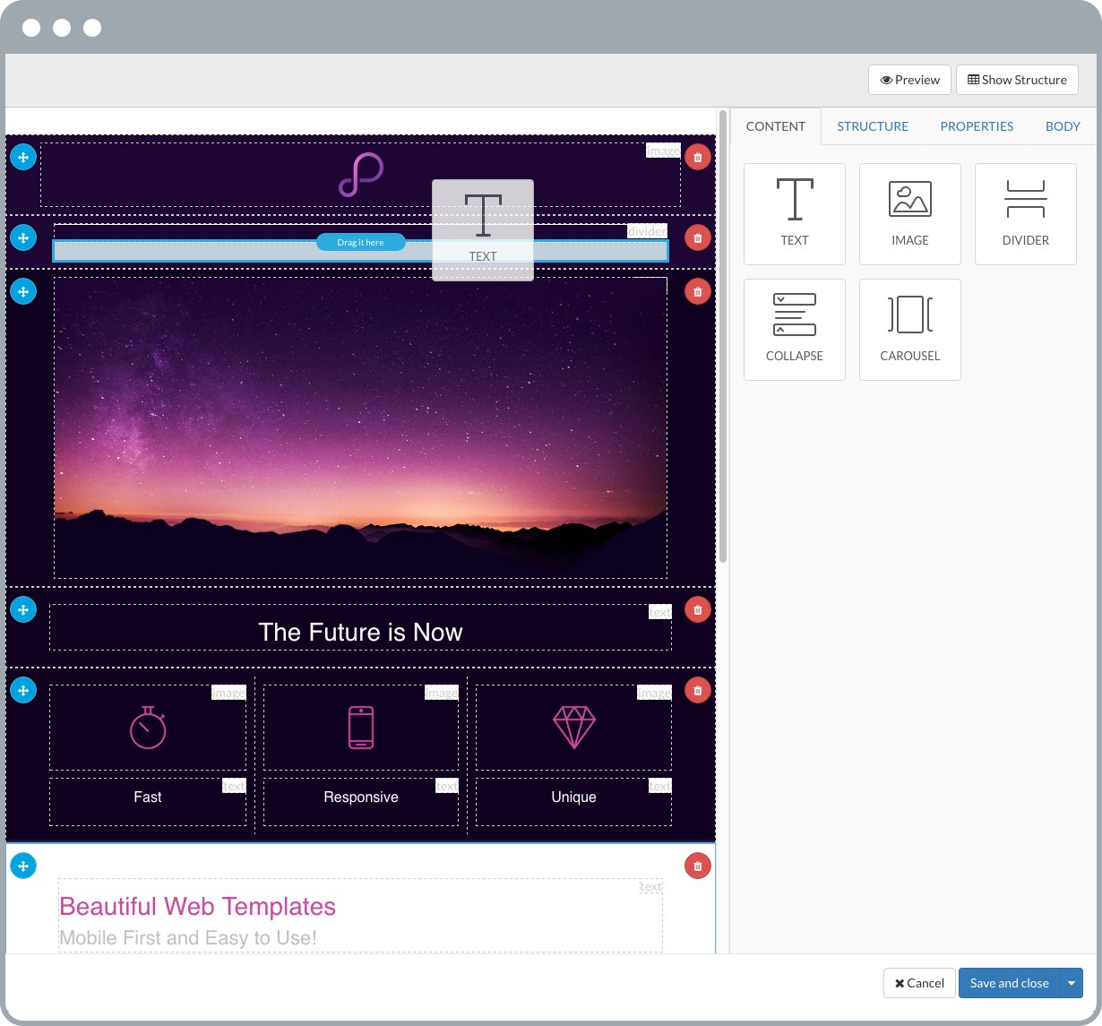
Create interactive mobile first content within Zunos Drive in just a few easy steps with the Content Creator tool in Zunos.
Create a new content page
- From Drive, click Create and choose Content Page from the list.
- You can create a content page from scratch by selecting a blank template or choose from one of the pre built templates.
*Note: We recommend that you choose from one of the existing templates. You can change any template by removing or adding content.

Creating and editing a content page
- Once you create the page you will be presented with the builder. Click on the fields to update the text or images.
- The Content tab shows the different content types which you can add by dragging and dropping them onto your page.
- The Properties tab will show you the details of the selected content in the builder. When you click on the content fields inside the builder the options will appear in the tool bar beside it. From here you can add padding, a border, change the size of an image and more.
- The Structure tab lets you divide the content types into different columns within the page. For example; to display 4 images across the page you could insert the 4 column structure on the page wherever you like.
- Click the Preview button at any time to view the page on your monitor, tablet or phone.
- Click save and close when you are finished. If you do not want to close the template, click the arrow beside Save and close and choose to Save (without closing)
- To save your content page as a template, which will appear in your templates list next time you create a content page, click the arrow beside Save and close and choose the Save as Template option. This will create a template from your content page which can be used when creating future content pages.
- Finally, to make the content page active in your account, select the file in the Drive list and choose to make it active in the content details panel on the right.

Descriptions of Content Types
- Text - The text box will allow you to enter and format the text.
- Image - Add an image from your computer. Once the Image Place Holder is dragged to your desired page location, select browse in the image properties to upload an image.
- Divider - Add a line or divider which helps to break up your page. Change the style, color, and width of the line in the divider properties.
- Collapse- This field displays interactive content. Use the collapse content to display a header and allow users to tap the arrow to read more.
- Carousel -This field displays interactive content. Add images and text to the carousel to allow users to swipe, tap or click to view more images along the carousel.
*Note: You can add links to any image in your content page. Links allow you to take a user to a location on the internet. After adding an image or a carousel image, you can add a URL into the 'Image Link' field. When a user clicks or taps on the image, they will be taken to that URL on the internet.
Comments
0 comments